Zenara
Designing a clinical tool that tells you what to do, not just what to know.
Zenara Health is building Zenara Assist — a clinical sidecar for modern psychiatry that runs alongside a clinician's EHR to surface comprehensive patient assessments, suggest diagnoses, and track outcomes over time. At its core is an AI-powered companion that catches clinicians up on patient history and flags what needs a decision before the visit even begins. I designed the patient assessment and outcome tracking modules, the clinician dashboard, and the design system. The hardest problem wasn't making it beautiful. It was making it fast to read in the three minutes before a patient walks in.
The Problem
A psychiatrist has minutes. The data doesn't care.
Zenara Assist surfaces an average of 8–10 clinically relevant findings per patient, compared to a standard benchmark of 2.8. That's not a rounding error — it's a fundamentally different picture of a patient. But a clinician doesn't have an hour to review it. They have minutes, often right before walking into the room. Assist's AI synthesizes patient self-report, history, and validated screening data into a coherent whole-person picture — but a picture is only useful if a clinician can read it in time. The design problem wasn't how to display all of that information. It was how to build a hierarchy that tells a clinician, without them having to hunt, what requires a decision right now versus what is important context to have absorbed.
The Product
Complete understanding before the first word.
Zenara Assist is the AI-powered layer that runs between a patient's self-report and a clinician's first question. Before a visit, it catches the clinician up: surfacing relevant history, flagging conditions that standard screenings miss, and suggesting diagnoses worth considering — not as directives, but as structured prompts that let the clinician walk in oriented rather than orienting. It's the difference between starting a session with a coherent clinical picture and spending the first fifteen minutes building one from scratch. Assist doesn't make decisions. It makes clinicians faster at making their own.
The Pivotal Choice
Actionable vs. informational the distinction that shaped everything.
Not all clinical information has the same job. Some findings require an immediate decision — a flag that changes how the clinician opens the conversation, a risk factor that affects the treatment plan. Mixing those with context-only findings in a flat list is one of the most common failure modes in clinical tools — it creates false equivalence and makes clinicians do the triage themselves, every time. Assist generates the clinical picture; the design makes it readable. The dashboard I designed makes the distinction structural: actionable items have different visual weight, position, and interaction patterns than informational ones — a principle that carried through every module.
The Design
Two modules, one coherent system.
Assess and Monitor have fundamentally different jobs — Assess is dense and scannable for the minutes before a visit, powered by Assist's AI to surface suggested diagnoses and catch clinicians up on patient history. Monitor tracks outcomes over time and makes PHQ-9 and GAD-7 trends readable rather than buried in a spreadsheet. The design system had to serve both: shared tokens and components that adapt across different information densities and interaction patterns, one coherent product.
SELECTED WORK
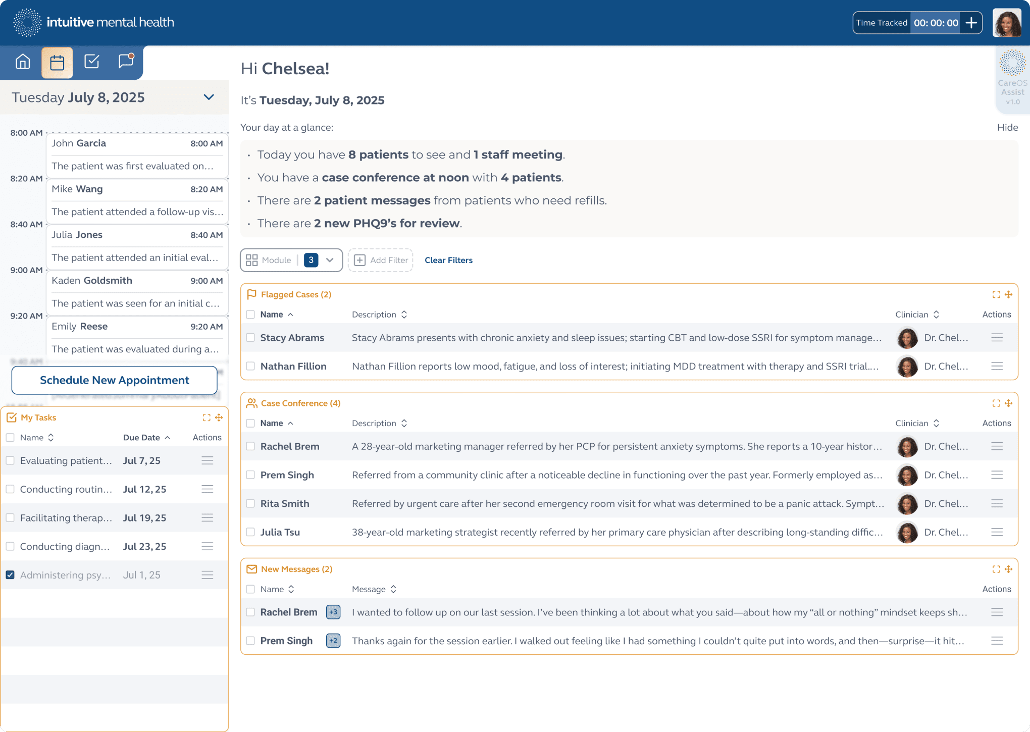
Assess Module
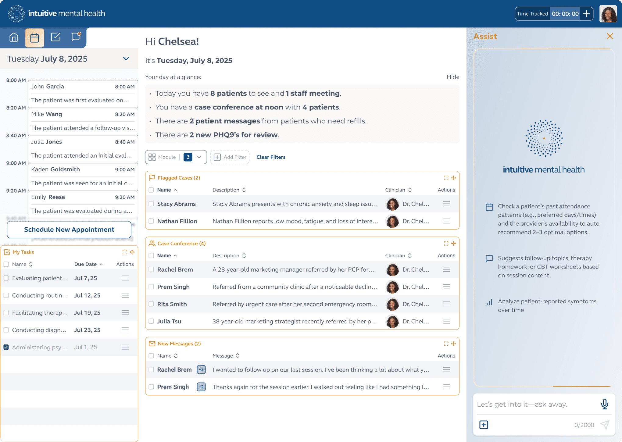
Clinician landing page that outlines their agenda, scheduled appointments, tasks, and AI Assist ready for use.
SELECTED WORK
Monitor Module
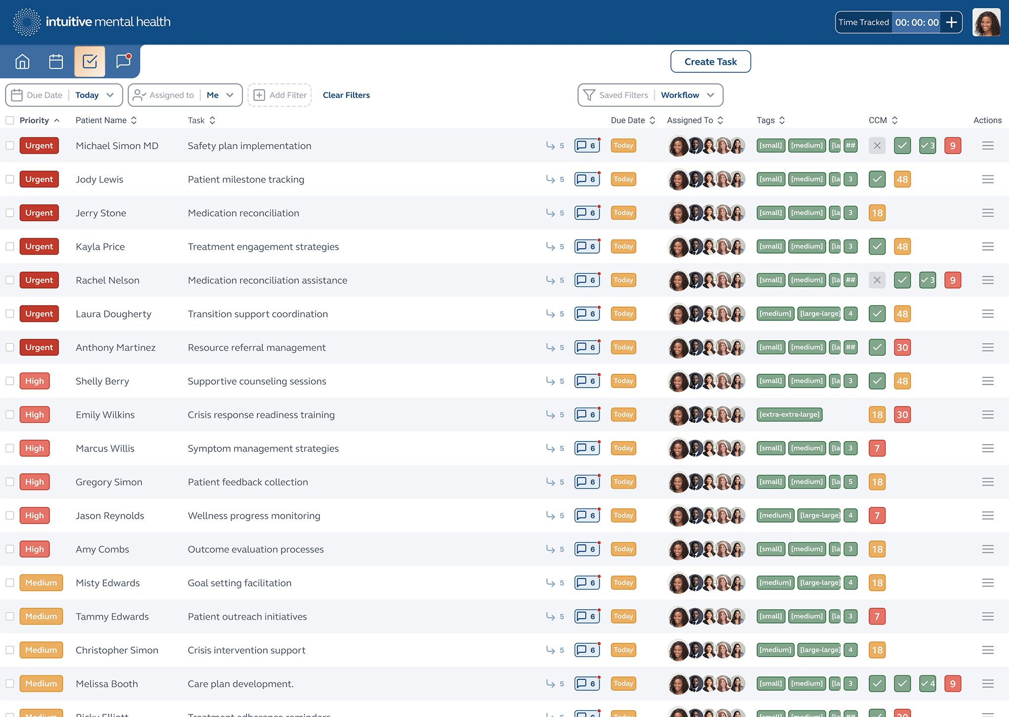
Care Coordinator task list and Chronic Care Management tracking.
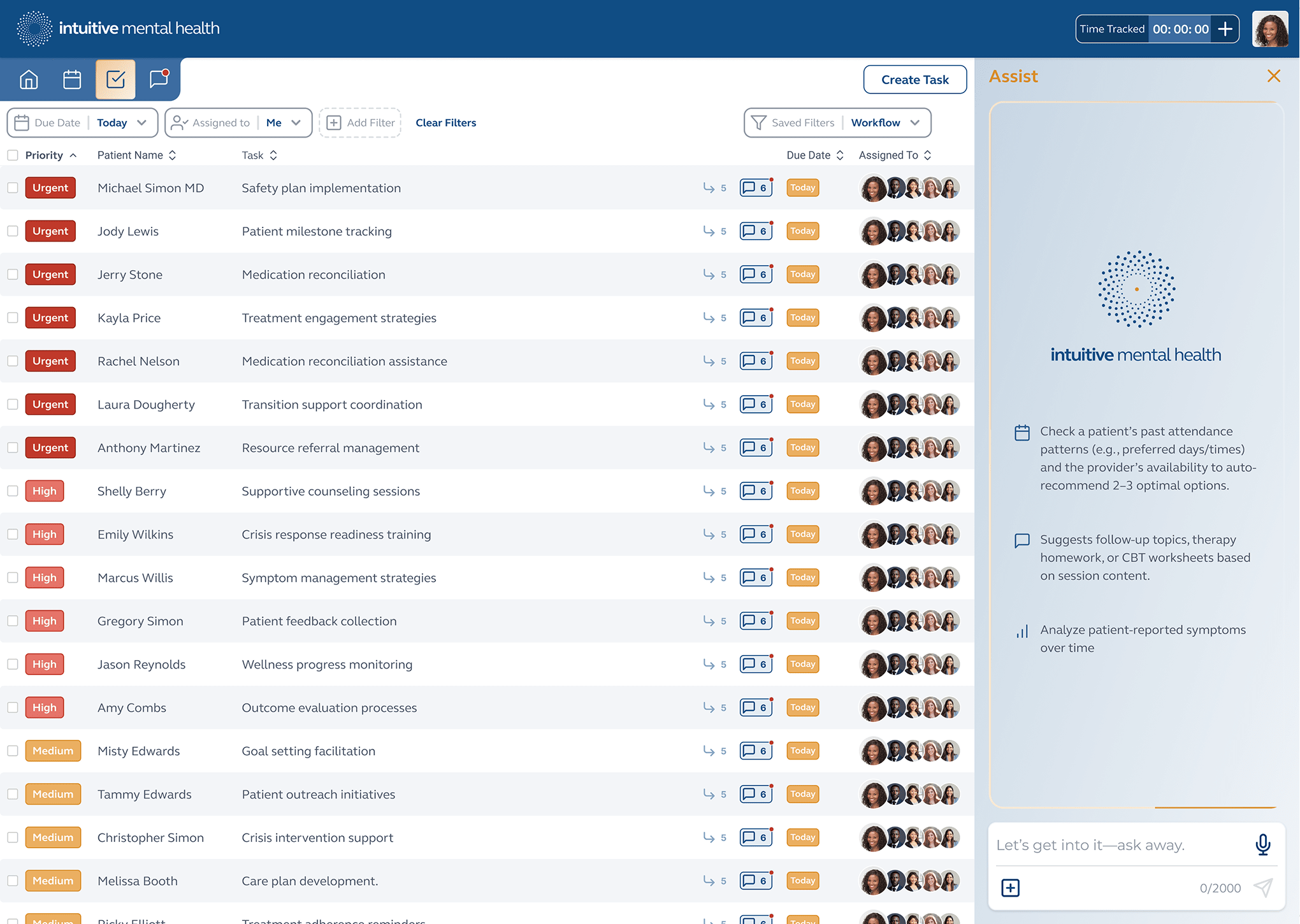
Care Coordinator task list sorted by priority, Chronic Care Management tracking and AI Assist ready for use.
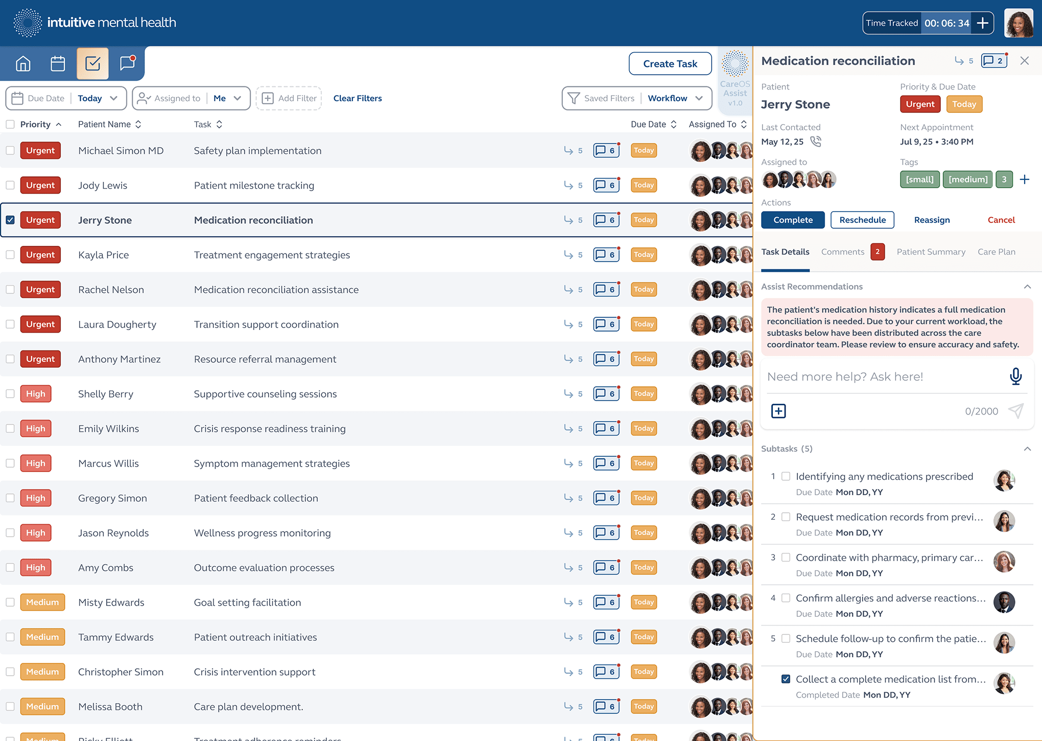
Individual task details and controls with AI Assist-recommended actions.
SELECTED WORK
Patient Mobile App
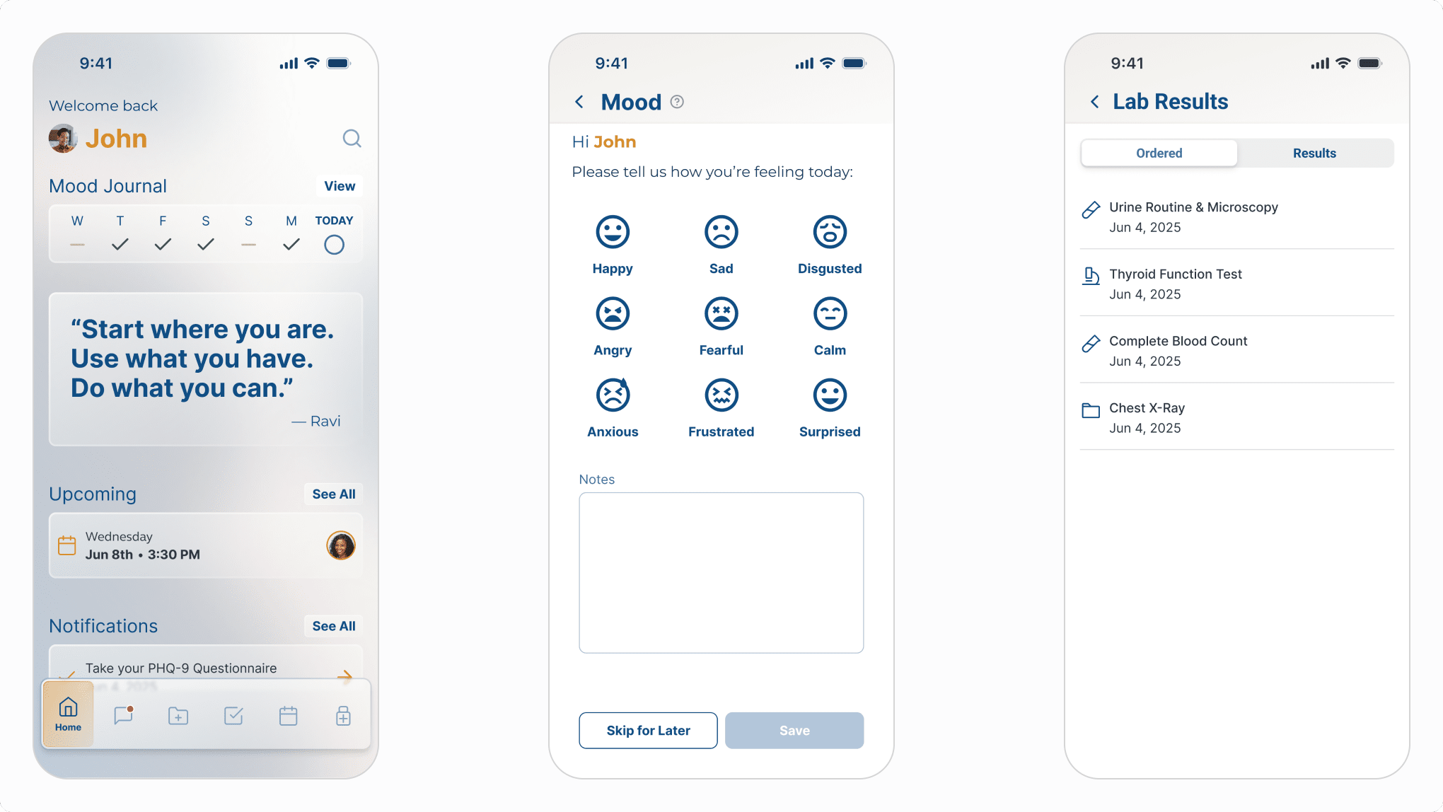
Patient-facing mobile app home screen, mood tracking and lab results.
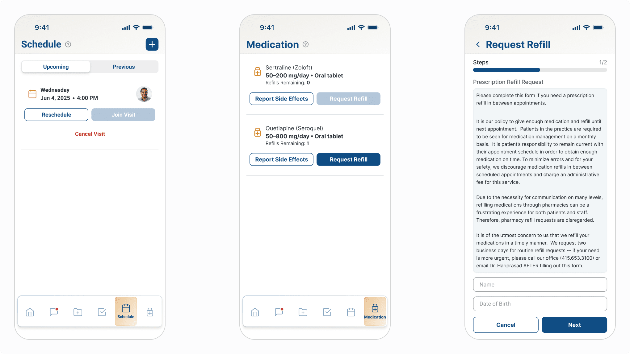
Visit management, medication management and refill request.
The Takeaway
What clinical design taught me about hierarchy.
Every product has an information hierarchy. Most products get away with an approximate one — users can compensate, reread, search. Clinical tools can't offer that margin. Zenara Assist's AI can surface ten findings, suggest a diagnosis that standard screening missed, and reconstruct six months of patient history in seconds. But if the design doesn't tell the clinician what to do with that in the time they have, the intelligence is wasted. When the user is a clinician and the context is a patient visit, the hierarchy isn't a design preference. It's a clinical instrument.